
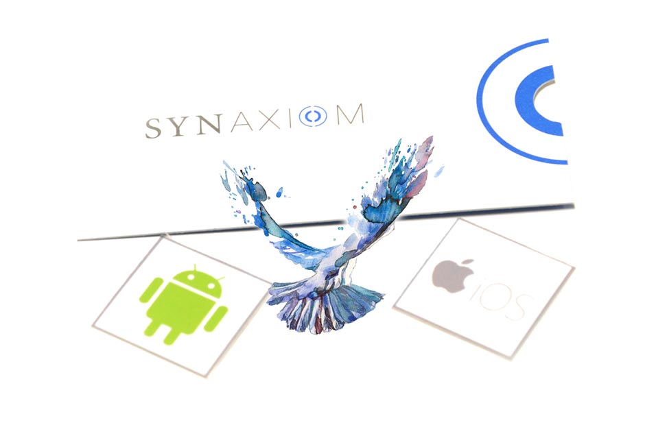
Mobile ServicesHTML 5 - A cross platform design
With years of experience in developing for mobile devices, SYNAXIOM has what it takes to build Enterprise class applications that are feature-rich, high performance & attractive working natively within the mobile device. With expertise in building iOS, Android & Windows native applications along with platform independent Web applications with HTML5, JS & CSS3 served up within your application container so it behaved just like a native application.
What is Responsive Mobile First design?
Responsive Mobile first design uses a combination of jQuery, HTML5 and CSS3 to bridge that gap between platforms & screen resolution effortlessly. The idea being that the interface & layout will change according to different screen sizes. Mobile first allows us to first design the mobile interface with a fluid grid with all the most pertinent content elements presented in a stacked intuitive sequential manner. As the screen size increases certain hidden elements along with the layout will shift to make the best use of the additional real estate. This type of fluid layout is very important for the best possible interaction and viewing experience. Mobile first design based on the content eliminates the need to address device specific breakpoints but creates a UI that looks great at any resolution.


WHY HTML 5?
INVEST IN THE FUTURE
- Persistent Local Storage − Persistent local storage allows for large amounts of data to be stored locally – so your website runs smoothly.
- WebSocket − Have more concurrent connections with HTML5’s ability to integrate web-sockets into your web infrastructure.
- Server-Sent Events − Keep your clients engaged and their applications updated using HTML5’s Server-Sent Events feature.
- Canvas −Supports a two-dimensional drawing surface that you can program with JavaScript.
- Audio & Video − Have your audio and video embedded directly on your website…without plugins!
- Geolocation − Allow visitors to share their whereabouts with you.
- Microdata − Lets you create your own vocabularies beyond HTML5 and extend your web pages with custom semantics.
- Drag and drop − Easy to use features such as drag&drop that allow for effortless re-location of webpage items.
- Complete list of features
Mobile App Development
Turnkey Mobile Applications for B2B & B2C
Don’t just engage your customers, WOW them with a memorable mobile experience
Increase brand recognition, solve a problem or even improve your productivity with a mobile app that integrates with your ecosystem
Build with SYNAXIOM
- Extend existing web applications to a mobile platform
- Develop with “mobile first” in mind
- Design based on the experience you are targeting for your users
- Build with hybrid app development frameworks & technologies
- Agile process for faster deployment